Published On Mar 30, 2020
#Infographics #ExcelCharts
Hello Friends,
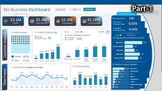
In this video, you will learn how to create beautiful 3D Gauge Chart. We have used Excel shapes and Pie Chart to create this beautiful visualization. You can use this chart in your business dashboard or presentation.
Please download the practice file from below given link:
https://www.pk-anexcelexpert.com/3d-g...
Download our free Excel utility Tool and improve your productivity:
https://www.pk-anexcelexpert.com/prod...
See our Excel Products:
https://www.pk-anexcelexpert.com/prod...
Visit to learn more:
Chart and Visualizations: https://www.pk-anexcelexpert.com/cate...
VBA Course: https://www.pk-anexcelexpert.com/vba/
Download useful Templates: https://www.pk-anexcelexpert.com/cate...
Dashboards: https://www.pk-anexcelexpert.com/exce...
Watch the best info-graphics and dynamic charts from below link:
• Dynamic Graphs
Learn and free download best excel Dashboard template:
• Excel Dashboards
Learn Step by Step VBA:
• VBA Tutorial
Website:
https://WWW.PK-AnExcelExpert.com
Facebook:
/ pkanexcelexpert
Telegram:
https://t.me/joinchat/AAAAAE2OnviiEk5...
Pinterest:
/ pkanexcelexpert
************ Suggested Books ********
VBA: https://amzn.to/2TMMikX
Excel Dashboard: https://amzn.to/2WZi2Fj
Power Query: https://amzn.to/2Ibd7xR
Power Pivot and Power BI: https://amzn.to/2DCg8BB
Exam Ref 70-778 (Power BI): https://amzn.to/2GnWYTN
************ My Stuff ***************
Mic : https://amzn.to/2TLnF88
Video Editor: https://screencast-o-matic.com/refer/...