Published On Aug 19, 2019
#KPICharts #ExcelInfograhics
Hello Friends,
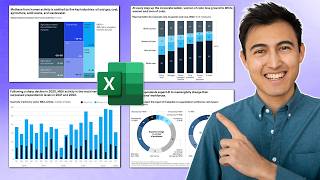
In this video, you will learn how to create a beautiful Group of Circle Charts. In this Group of Circle Charts, we have displayed Market level and Over all service level. You can use it in your business dashboard or prestation.
Click here to download the practice file:
https://www.pk-anexcelexpert.com/grou...
Download our free Excel utility Tool and improve your productivity:
https://www.pk-anexcelexpert.com/prod...
See our Excel Products:
https://www.pk-anexcelexpert.com/prod...
Visit to learn more:
Chart and Visualizations: https://www.pk-anexcelexpert.com/cate...
VBA Course: https://www.pk-anexcelexpert.com/vba/
Download useful Templates: https://www.pk-anexcelexpert.com/cate...
Dashboards: https://www.pk-anexcelexpert.com/exce...
Watch the best info-graphics and dynamic charts from below link:
• Dynamic Graphs
Learn and free download best excel Dashboard template:
• Excel Dashboards
Learn Step by Step VBA:
• VBA Tutorial
Website:
https://www.PK-AnExcelExpert.com
Facebook:
/ pkanexcelexpert
Telegram:
https://t.me/joinchat/AAAAAE2OnviiEk5...
Twitter:
/ priyendra_kumar
Pinterest:
/ pkanexcelexpert
Send me your queries on telegram:
@PKanExcelExpert
************ Suggested Books ********
VBA: https://amzn.to/2TMMikX
Excel Dashboard: https://amzn.to/2WZi2Fj
Power Query: https://amzn.to/2Ibd7xR
Power Pivot and Power BI: https://amzn.to/2DCg8BB
Exam Ref 70-778 (Power BI): https://amzn.to/2GnWYTN
************ My Stuff ***************
Mic : https://amzn.to/2TLnF88
Video Editor: https://screencast-o-matic.com/refer/...