Published On May 24, 2023
☕ If you find my Excel videos useful and would like to support me, you can buy me a coffee -https://www.buymeacoffee.com/buddyatwort
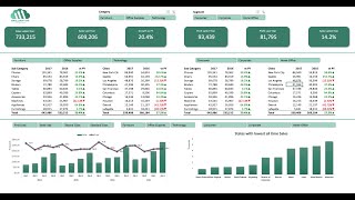
Welcome to Buddy At Work! In this MS Excel basic dashboard tutorial, we will guide you through the fundamental concepts of creating an effective dashboard using pivots, slicers, and charts only in 30 minutes.
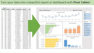
Dashboards are invaluable tools for analyzing and presenting data in a concise and visually appealing manner. In this tutorial, we will walk you through the step-by-step process of building a basic dashboard that leverages the power of Excel's pivot tables, slicers, and charts.
We will start by explaining the concept of pivot tables and how they can help you summarize and analyze large sets of data with ease. You'll learn how to create pivot tables, manipulate their structure, and customize their calculations to extract meaningful insights from your data.
Next, we will introduce you to slicers, a powerful feature in Excel that allows for interactive filtering and slicing of data. You'll discover how to create slicers and link them to your pivot tables, enabling you to dynamically filter and drill down into your data to focus on specific aspects of your analysis.
Charts play a crucial role in visualizing data trends and patterns. In this tutorial, we will show you how to create various chart types in Excel, such as bar charts, line charts, and pie charts, and demonstrate how to link them to your pivot tables for real-time visual representation of your data.
Throughout the video, we will provide you with practical examples and tips on dashboard design principles, including layout considerations, color schemes, and chart formatting options, to ensure that your dashboard is not only informative but also visually appealing.
By the end of this tutorial, you will have a solid foundation in using pivot tables, slicers, and charts to create basic yet powerful dashboards in Excel. Whether you're a beginner or an intermediate Excel user, this tutorial will equip you with the necessary skills to analyze and present your data effectively.
Don't forget to subscribe to our channel to stay updated with the latest Excel tips and tutorials. Join us now and let's dive into the world of MS Excel basic dashboards with pivots, slicers, and charts!
Practice file link:
https://docs.google.com/spreadsheets/...
OFFSET Function Tutorial
• Offset Function in Excel Explained in...
Watch More Dashboard Tutorials:
• Excel Dashboards
WhatsApp Group Link:
https://chat.whatsapp.com/BqsVBtl9tjp...