Published On Jun 19, 2018
Microsoft Excel Tutorial: Place people on a bell curve.
Welcome to the MrExcel netcast, where we bring you the best tips and tricks for mastering Excel. In this episode, we will be discussing how to place people on a bell curve using Excel. This question comes from Jimmy, who attended one of my seminars in Huntsville, Alabama. He wants to summarize his data and plot it on a bell curve, and I'm here to show you how it's done.
If you're familiar with my YouTube channel, you may have seen my video on creating a bell curve in Excel. In that video, I used a series of fake X values to create a nice looking curve. However, in this episode, we will be using the actual data of people and their scores to create the curve. So let's get started.
First, we will create a pivot table with the people's names on the left and their average scores. Then, we will sort the pivot table from highest to lowest and remove the grand total at the bottom. Next, we will calculate the mean and standard deviation of the scores, which will be used to determine the height of each person on the bell curve.
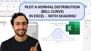
Now, here's where the magic happens. We will use the NORM.DIST function to calculate the y-value for each person, using their x-value, the mean, and the standard deviation. Then, we will copy this data to a new range and create an XY scatter chart with smooth lines. If you're using Excel 2010 or earlier, you will need to use the Chart Labeler add-in by Rob Bovey to label the points. But if you're using Excel 2013 or newer, you can easily label the points by selecting Data Labels and choosing "From Cells" to specify the names.
To make the chart look more presentable, we can adjust the scale along the bottom and move any labels that may be overlapping. And just like that, we have successfully placed people on a bell curve using Excel. This is a great way to visualize and analyze data, and I'm sure Jimmy will find it very useful.
If you want to learn more Excel tips and tricks, be sure to check out my book, MrExcel LIVe, The 54 Greatest Excel Tips of All Time. And don't forget to download the workbook from today's video using the link in the YouTube description.
I want to thank Jimmy for this awesome question and for inspiring this episode. And thank you for tuning in to the MrExcel netcast. I'll see you next time for more Excel mastery.
Buy Bill Jelen's latest Excel book: https://www.mrexcel.com/products/latest/
You can help my channel by clicking Like or commenting below: https://www.mrexcel.com/like-mrexcel-...
Table of Contents
(0:00) Plot people on a bell curve in Excel
(0:18) Recap of Video 1663 for a bell curve without people plotted on it
(0:40) Using NORM.DIST function
(1:02) Using a pivot table to summarize data by person
(1:37) Calculate Mean & Standard Deviation
(2:20) Using NORM.DIST for each person
(2:44) Creating X-Y Scatter Chart from People
(3:01) Changing Scale of X-Axis
(3:33) Labeling each point with name of person
(4:25) Fixing where two name labels overlap
(5:22) Clicking Like really helps the algorithm
#excel #microsoft #microsoftexcel #exceltutorial #exceltips #exceltricks #excelmvp #freeclass #freecourse #freeclasses #excelclasses #microsoftmvp #walkthrough #evergreen #spreadsheetskills #analytics #analysis #dataanalysis #dataanalytics #mrexcel #spreadsheets #spreadsheet #excelhelp #accounting #tutorial
This video answers these common search terms:
Adjusting scale and formatting on a chart in Excel
Calculate mean and standard deviation in Excel
Create a Bell Curve in Excel
Download workbook from the YouTube video
Episode 2217: Place People on a Bell Curve
Labeling points on a chart in Excel
Learn Excel from MrExcel Podcast
Pivot table in Excel
Scatter chart with lines in Excel
Summarize data and plot results on a bell curve
Using NORM.DIST function in Excel
Using Ron Bovey's Chart Labeler add-in for older versions of Excel
Join the MrExcel Message Board discussion about this video at https://www.mrexcel.com/board/threads...
Jimmy from Huntsville wants to arrange people on a bell curve
Use a pivot table to figure out the average score.
Sort the pivot table so the scores are arranged low to high. These scores will be the X values.
In an extra cell, calculate the AVERAGE() and STDEV() of the scores.
Use formulas to copy the data from the pivot table to a new range
Calculate a Y value for each person with =NORM.DIST(A2,Mean,StDev,False)
Create an XY Scatter chart with smooth lines
In Excel 2010 or Earlier, use Rob Bovey's Chart Labeler add-in (Google it…)
In Excel 2013, Add Data Labels, From Cells, Specify the names
Micro-adjust the chart to change the scale and move the labels that overset each other
To download this workbook: https://www.mrexcel.com/download-cent...
To create a bell curve without the people, use my previous episode 1663 here: • Excel - Create A Bell Curve in Excel ...