Published On Jul 4, 2024
(Opinion disclaimer: this is just my opinion and is constructive criticism to the hosts and creators)
This level feels like an undercooked soggy pizza. It could have been great but it needed to cook for longer.
This is a showcase of Trick's super buffed Top 1 version and was provided to me by him. He is aware of my criticisms. That said, this should really not be top 1.
For one, the difficulty feels super forced and it's not fun to play. Difficult levels that are fun to play look difficult and feel satisfying to pull off. This level is neither of these. Most of the hardest parts are choke points that don't even appear visible when playing. Also, why make a level like this and then make it completely inaccessible to 99.999% of the community? It makes zero sense to do that. It's just a tactic used to give the level clout. This level really should have made itself well decorated enough to stand out without being so damn difficult instead. It would be much better if the level was around the same difficulty as ACB and I hope Trick can do this, because right now APT is just going to be new Avernus.
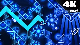
The decoration is good, but not great. It's not worthy of the levels it is a remake of in my opinion. Bloodlust already did it much better, and that was years ago. This level takes the concept nowhere sadly. Not to throw shade at the creators, but lava floor structuring for half the level doesn't work. It's the idea of hell from a 7 year old that's just gone to the nether in Minecraft and it's just getting a bit old. You could even turn it red and make it into a bloodbath instead or something. There are much better ways to think about the concept, just look at what Greafer does. The decoration is insanely good at some parts, then poor, badly composed or straight up copy paste glow style in others. It's incredibly inconsistent in theme and quality, this level cannot decide what it wants to be.
This level is less of a remake and more of a rip off. Most parts completely disregard the old decoration and just make something new up. Even if it looks cool, a lot of it completely loses the atmosphere created by the original. The last wave in cataclysm is a prime example of how to rob all the original energy from a part and replace it with (albeit pretty nice looking) glow style that looks like a production line list challenge. You have to keep the original colours and composition, like, make the background red and the structures super dark with small slivers of red coming through, you can still do the same style, just change it up.
Not to mention the sync of the level. I had to make about 10 speed stretches and cuts in DaVinci resolve to get this thing to sync properly. It has been merged lazily (I would know, I had to do the same for bottomless pit which I merged) and this will impact on the player, especially when a lot of people going into the level will already have click patterns memorised, which will inevitably fall apart when the sync is different.
What's with the end screen taking up 8% of the level again? Did APTeam not learn from SWI? This just confuses anyone looking at progress because 92% is basically 100% now. We didn't need a second bloodbath extension. And the shake triggers (cop out for fake intensity) are really annoying. Why is the level just continuously shaking? That's just annoying... I had to turn them off to be able to watch the level more than once in a row. They work best when used to emphasise impactful moments in the gameplay or music, not when you just shake the level the entire way through.
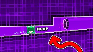
I could make a whole video going through the secret ways in this level. There are so many playtesting errors and things left out, whoever play tested this clearly just wanted a copy of the level to play and didn't take anything about bug finding seriously, or just wasn't great at it. I'm happy to point them out in a call with anyone who wants to fix them.
It's sad to see a lack of respect or effort put into such a big project, and I normally wouldn't be so harsh, but remaking something like this comes with an obligation to make a really good level, and I just can't get behind this. Much smaller projects made by even single people are a lot more memorable than this. (Nullscapes, Kyouki)
I was going to make a whole wavix video about this explaining in more detail but I decided against it because I don't like to put a lot of effort just to make a negative video. A long video description will be enough to get my feelings across, and I will save the doc making skills for something more worth it.
Overall, a community icon has been rendered into homogenous glow style, turning it into a forgettable, samey upcoming top 1 that will never get verified. As someone who had very high hopes for this level, I am disappointed. I think APTeam has forgotten how to make good levels with this one, or just don't care. Big miss.
Rating: 4/10