Published On Premiered Sep 21, 2024
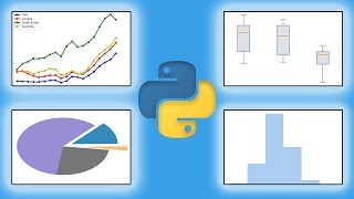
In this video, we dive into the world of data visualization using Pandas. Learn how to create various types of charts and plots directly from your Pandas DataFrames, with minimal code! We’ll walk you through how to generate line plots, bar charts, scatter plots, and histograms using Pandas’ built-in plotting capabilities.
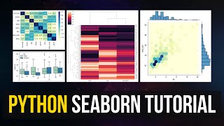
You’ll also discover how to customize your visualizations by adding titles, labels, and colors, and we’ll briefly introduce Seaborn and Matplotlib for enhanced, high-quality visuals.
What You’ll Learn:
How to create line plots, bar charts, scatter plots, and histograms using Pandas.
Customizing plots: Adding titles, axis labels, changing colors, and more.
How to use Seaborn and Matplotlib for even better visualizations.
Whether you're analyzing sales data or working on a data science project, mastering data visualization with Pandas is an essential skill for conveying insights and trends clearly. Watch now to enhance your data analysis toolkit!
Datasets: https://github.com/oladimeji-kazeem/data-s...
Further contacts:
github: https://github.com/oladimeji-kazeem
linkedin: https://www.linkedin.com/in/oladimeji/
medium: https://medium.com/@olakazeem
X (Former Twitter) : https://x.com/GloballyAI