Published On Aug 19, 2021
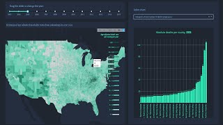
Data visualization with python
0:00 Introduction to Jupyter Notebook
11:20 Loading in packages: Pandas
19:15 Loading in packages: Numpy
22:40 Loading in packages: Seaborn, Matplotlib, and Plotly
32:00 Importing Data
43:00 Describing the dataset (Len, shape, variables)
47:40 Describing the variables
56:25 Getting counts of categorical values (value_counts)
1:03:00 Transforming features
1:11:00 Pandas to_datetime() function
1:30:55 Filtering rows by creating lists
1:39:10 Filtering rows by date
1:50:05 Keeping only columns/features we want
1:56:00 Outcome variables (hospitalizations, deaths, new cases)
1:59:30 Total COVID cases by MONTH - cumulative counts
2:06:00 Pivot table - cases by month for five counties
2:09:25 Seaborn Barplot - COVID cases by month
2:11:55 Seaborn Barplot - COVID cases by month by county
2:13:55 Plotly - COVID cases by month
2:21:35 Total COVID cases by DAY - cumulative counts
2:22:40 Pivot tables - cases by day for five counties
2:26:15 Creating filters (startdate and enddate) for day time field
2:30:15 Filter gut check - looking at single county between April 26, 2020 and May 9, 2020
2:32:00 Seaborn Barplot - COVID cases by day
2:33:00 Seaborn Barplot - COVID cases by day by county
2:34:10 Plotly - COVID cases by day by county
2:37:00 Understanding we need to transform outcome variables together to replicate chart
2:38:40 Looking at new hospitalizations
2:46:30 Plotly chart that combines new hospitalizations, new deaths, and new COVID cases