
Published On Jan 19, 2023
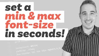
The Clamp() function is amazing for responsive typography - and there are many online calculators to help you with the formula to add, but what if you wanted to have a copy of each Tag formula, and to paste it all in one go, rather than Line by Line?
A bit of graft - trial & error - and spitting fire - has led me to a new Clamp() Calculation Generator :)
Book your 1-2-1 Consultation: https://websquadron.co.uk/socials
Access the Calculator here:
https://websquadron.co.uk/font-clamp-...
Some good practice is: (below shows Desktop and then Mobile - by using Font Clamp we can make it responsive for any screen size).
H1= 48px 32px
H2= 32px 26px
H3= 26px 22px
H4= 22px 18px
H5= 18px 16px
H6= 16px 16px
Body = 16px 16px
How to make Fonts Responsive with my Clamp() Calculation Generator - New - Paste in One Go - Fluid
We love to create - share - respond - and deliver.
🧐 Learn with our Mastery Modules: https://websquadron.co.uk/web-design-...
🔗 All of our Important Links: https://websquadron.co.uk/socials/
😃 Join our Facebook Group: / 3309523509284305
😃 Get Code Snippets Pro: https://r.freemius.com/10565/3304295/
😃 Get Elementor Pro: https://be.elementor.com/visit/?bta=2...
😃 Boost your YouTube Analysis: https://www.tubebuddy.com/websquadron
👕 Get our Merchandise: https://websquadron.co.uk/merchandise
🥹 Support us: https://paypal.me/Websquadron
Hire us to work on your Website!
💌 [email protected]
👩💻 Visit https://websquadron.co.uk


